11+ Maths Solved Topic Wise Questions - 2026
- Practice 15K+ topic-wise questions, tagged by difficulty.
- Unlock instantly, 2025 11+ exams, 245+ Maths Past Papers.
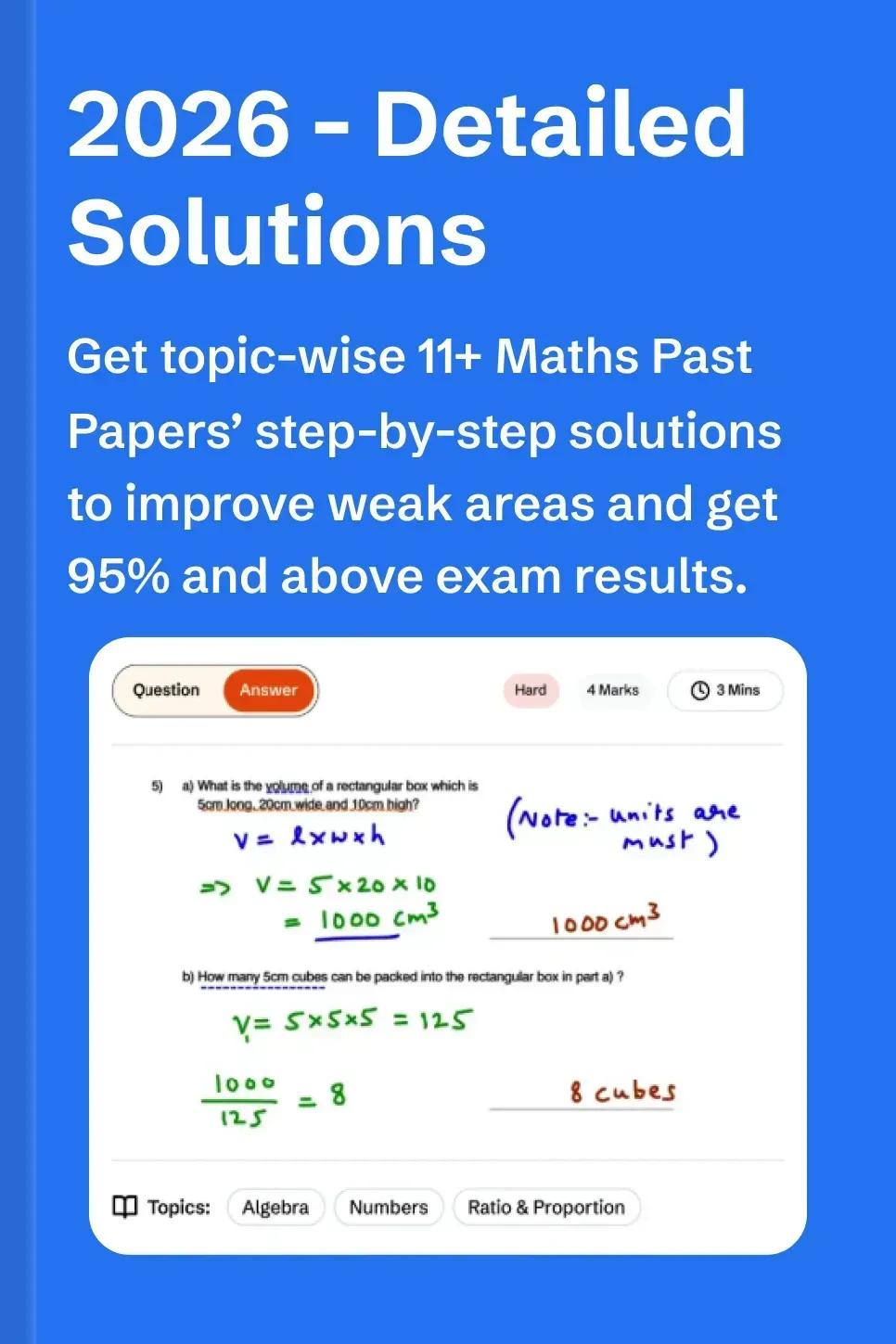
- Access detailed step-wise solutions by 11+ examiners on the website.
- Boost exam speed, accuracy, and confidence for 11 Plus exams.
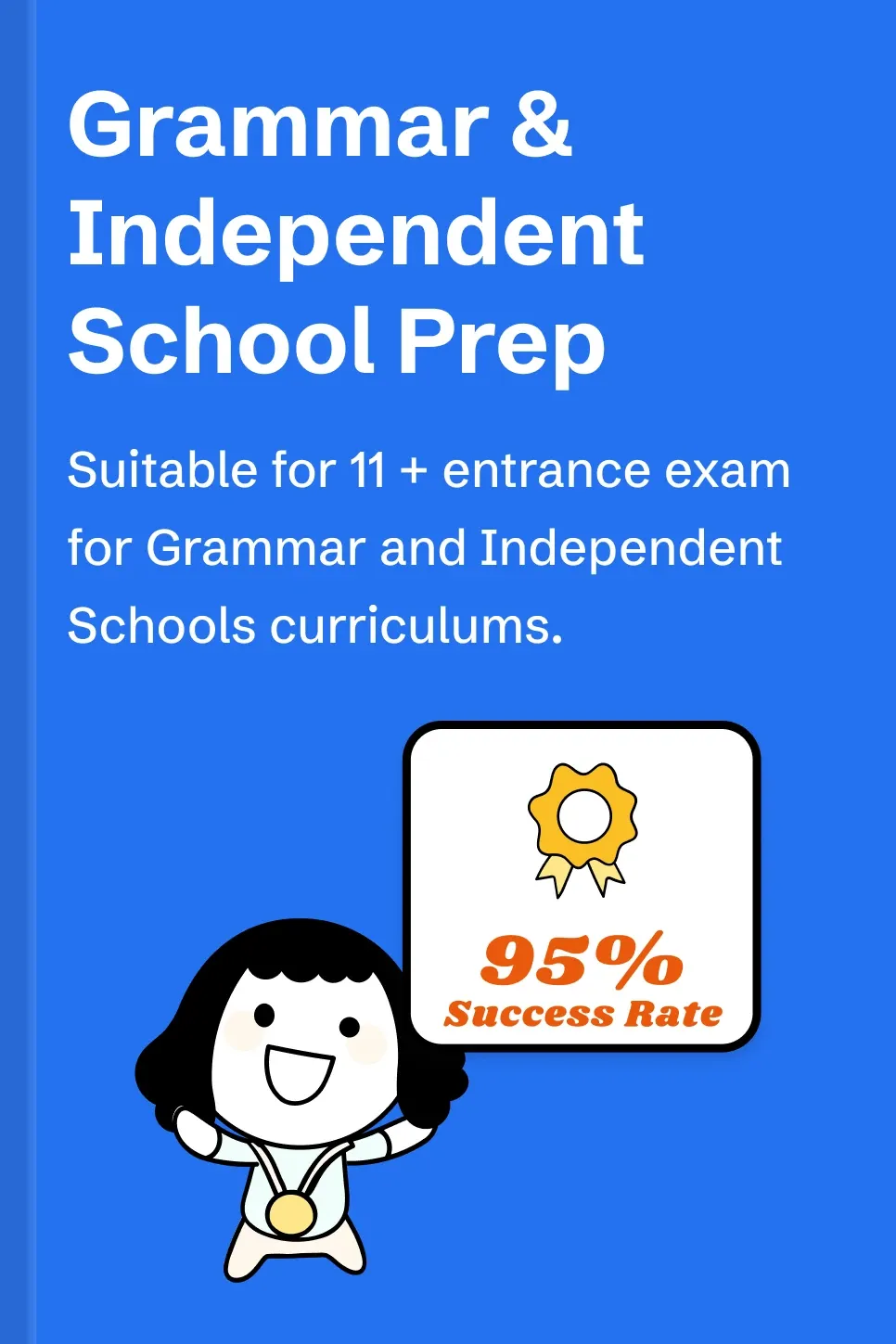
- Suitable for Grammar and independent school 11+ exams.
- Get full 11+ Maths exam syllabus and download paper planner.
11+ Exam Topics
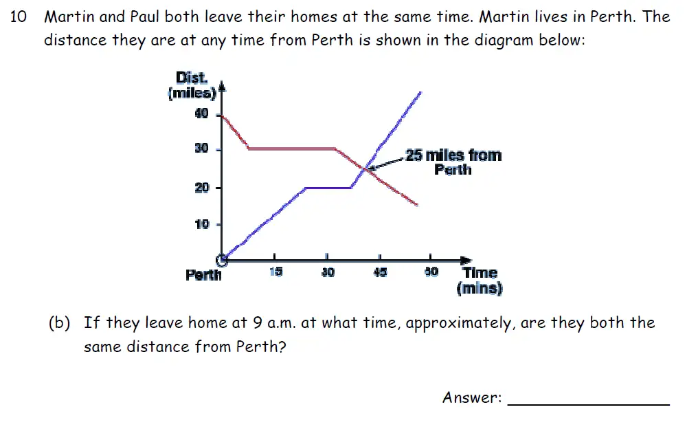
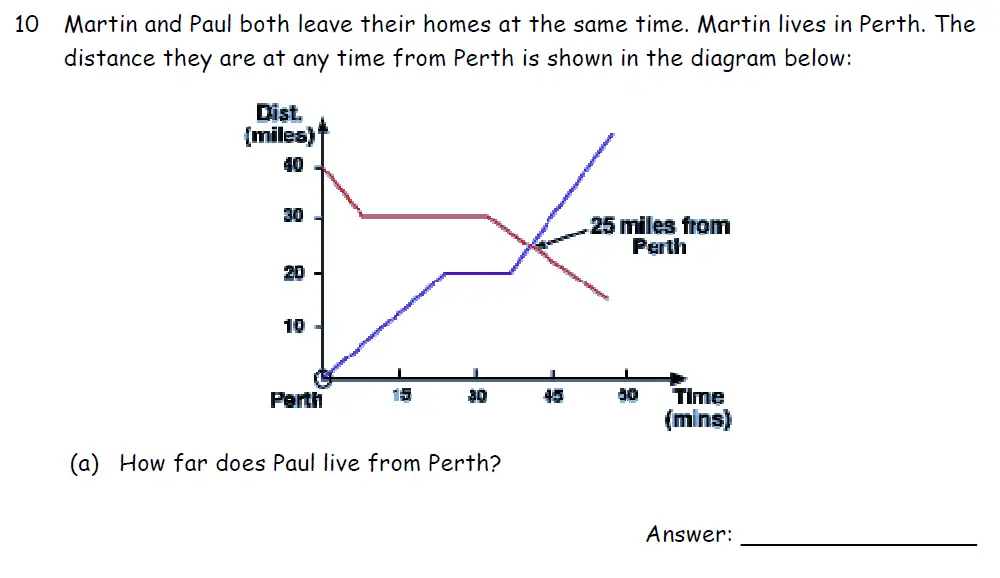
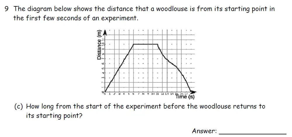
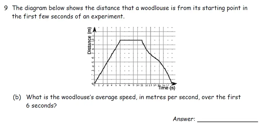
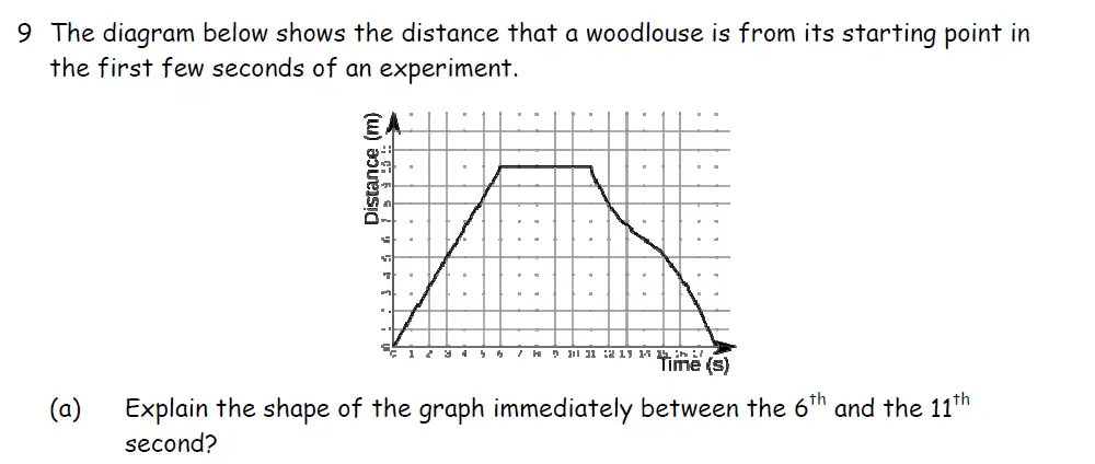
Line Graph - 11 + Exam 2026 Questions & Answers

Topics Covered:
Topics Covered:
Topics Covered:
Topics Covered:
Topics Covered:
Topics Covered:
Key Features of 11+ Maths Solved Topic Wise Questions
Detailed Answers


Benefits of 11+ Maths Solved Topic Wise Questions

Students
- Stay updated with the 2025 11+ exam format.
- 15,000+ Topicwise Maths questions with answers.
- 95% success rate for Grammar & Independent School entry.

Parents
- Track 11+ progress with step-wise answers.
- Affordable, high-quality exam resources.
- Exam planner to create a study plan.

Tutors & Businesses
- Complete 11+ Maths coverage for teaching.
- Timed, difficulty-assigned questions to create personalised study materials.
- Evaluate student progress with step-wise solutions and planner.
How to Use 11+ Maths Solved Topic Wise Questions
Select your practice topic
- Select a topic of your choice from the left side.
- Create a study plan with the downloadable planner.
Mark Your Answers

- Solve under timed conditions.
- Mark your answers with the answer explanation provided.
Track the progress

- Solve the full 11+ maths past papers.
- Strengthen weak areas with targeted topic practice.
Understanding and Interpreting Line Graphs for 11+ Exams

11+ Maths Topicwise Worksheets Banks
11+ Maths Solved Topic Wise Questions - 2026
Excellent for 11+ mock prep
We’ve been using PiAcademy to prepare for the 11+ exams, and I’m really impressed. My son has been working through past papers from Hampton, and the questions, which has really...
CP
Claire L. - Parent
Confidence boost in Statistics
My daughter’s progress in maths has been improved. She earlier faced issues in Statistics, but now feels much more confident tackling this topic. The resources help her stay on track,...
SP
Sophie - Parent
Great mix of question levels
My daughter loves the mix of easy and hard questions. The timer helps her understand how much time to spend on each problem, which has made a big difference in...
TP
Tom D - Parent
Helpful for tricky maths topics
I’ve been so impressed with a lot of 11+ Maths practice questions available with proper explanations helping him grasp tricky concepts. He's improving in tougher word problems of Algebra as...
MP
Meera Singh - Parent
Time saver for tutors
As a Tutor, PiAcademy has been an absolute time saver for my students preparing for 11 Plus Examination. The fully worked out solutions are clear and easy for my students...
MT
Mark S. - Teacher
Tracks progress effectively
I’m really happy with PiAcademy. The way it tracks my child’s progress with detailed answers is reassuring. It’s great to have an affordable, high-quality resource that actually works.
PP
Phoebe Griffiths - Parent

