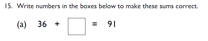
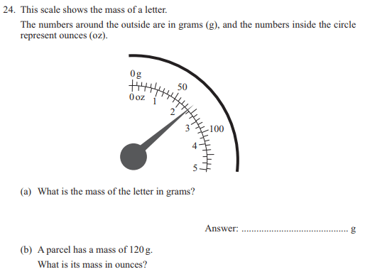
Question
Answer
Solve in:
1 min


Data collection and presentation refers to the process of collecting and organizing data in a meaningful way so that it can be analyzed and interpreted. This concept is important in many fields, including science, business, and education.
Data collection involves gathering information through various methods, such as surveys, observations, and experiments. This may involve creating charts, graphs, or tables to display the data visually, or using statistical methods to analyze the data and draw conclusions.
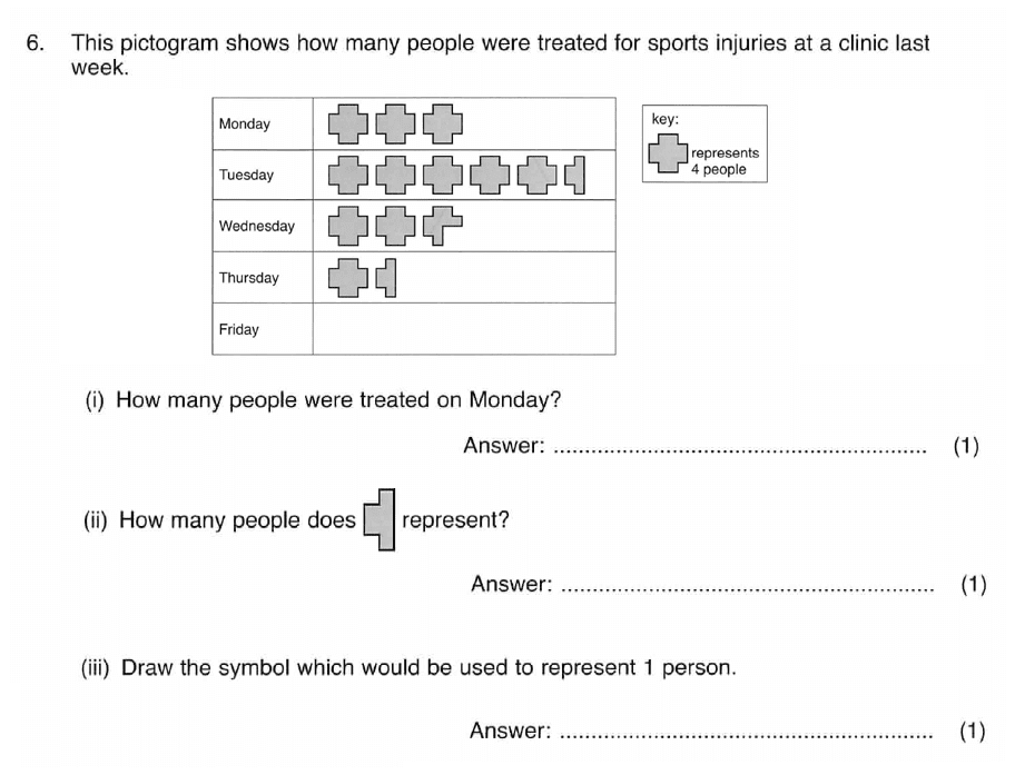
Pictogram is a chart that uses pictures or symbols to represent data. Every pictogram has a key which shows the value of each symbol or picture. A pictogram design can be constructed using a table with two columns. In the first column is the name of the group, and the second column features the pictures.
The pictogram below shows information about the favourite subjects of some students in a class.
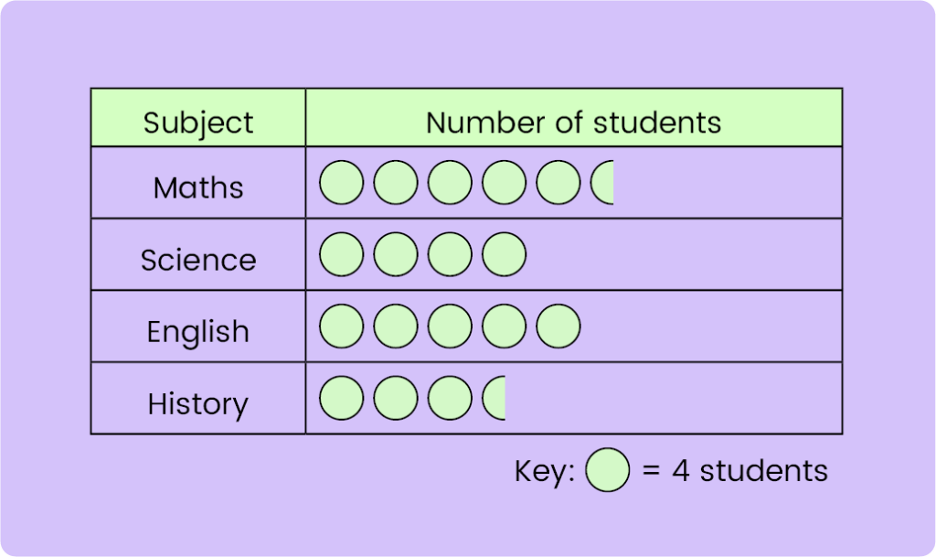
The first column in the above pictogram shows the list of subjects, while the second column shows the number of students who like the particular subject, using the circle symbol. According to the key in the pictogram, each circle represents four students. Which means the each half-circle in the pictogram represents 2 students.
Example: The pictogram below gives information about the types of ice-creams sold in an ice-cream parlour on a day.
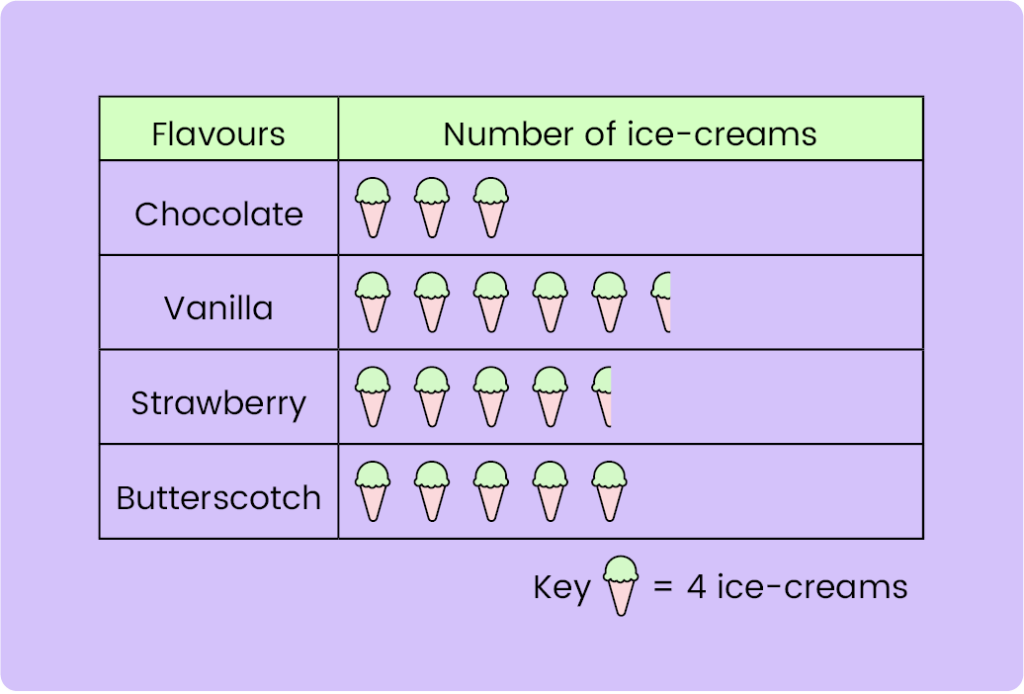
a) How many vanilla ice-creams were sold?
b) How many more strawberry ice-creams were sold than chocolate ice-creams?
Solution:
a) Step 1: Selecting the row
Row: Vanilla
Step 2: Finding number of ice-creams sold
Number of symbols in row vanilla = 5 1⁄2
Number of vanilla ice-creams sold = 5 1⁄2 × 4
= (5 × 4) + (1⁄2 × 4)
= 20 + 2
= 22
Hence, 22 vanilla ice-creams were sold.
b) Step 1: Selecting the rows:
Rows: Chocolate, Strawberry
Step 2: Finding number of ice-creams sold
Number of symbols in row chocolate = 3
Number of vanilla ice-creams sold = 3 × 4 = 12
Number of symbols in row strawberry = 4 1⁄2
Number of vanilla ice-creams sold = 4 1⁄2 × 4
= (4 × 4) + (1⁄2 × 4)
= 16 + 2
= 18
Step 3: Perform the required calculation:
18 - 12 = 6
Hence, 6 more more strawberry ice-creams were sold than chocolate ice-creams.
A tally chart is a simple way of recording data and counting the amount of something (frequency). The frequency in the tally chart is represented by the tally marks.
Tally marks are written as a group or a set of five lines. The first four lines are aligned vertically, and the fifth line runs diagonally over the vertical four lines.
Look at the table below to understand the logic of how to count the tally marks.
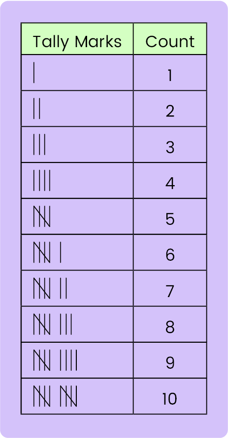
We can see from the above table, that every fifth line is drawn diagonally, and the count six is represented by a single vertical line after a set of five lines.
Example:
Jack has a dodgy dice. He rolls it 30 times and records the results in a tally chart. Fill in the last column of the chart.

Solution:
The frequency table shows
2 + 4 + 5 + 6 + 3 + x = 30
Number of times the dice lands on 6 = 30 - (2 + 4 + 5 + 6 + 3)
= 30 - 20
= 10

A line graph is used to compare two sets of data that are related in some way. Most commonly, a line graph is used to show how something changes over time, maybe over the course of a week, a year, or even longer.
Line graph shows how values shown on Y- axis changes as another value changes on X- axis
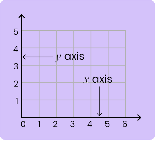
Line graphs use points that are connected by lines which allow values to be estimated along a line drawn through the points.
For example, a graph to show how the temperature of water increases with time when it is heated.
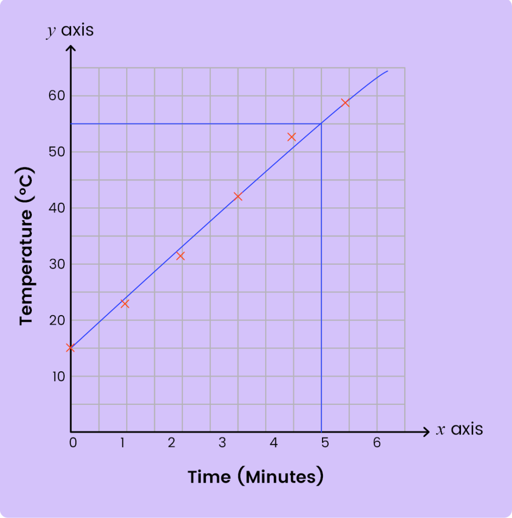
What was the temperature of the water after 4.5 minutes?
First take a look at the two axes and try to understand what these axes denote
Let us now draw a parallel line from the x- axis on the plotted line from 4.5 min. Join the perpendicular line on the y-axis.
At 4.5 minutes, the temperature was 56°C.
Example: On a summer day, Jack starts filling a paddling pool with water. The graph below shows the depth of water in the paddling pool over time.
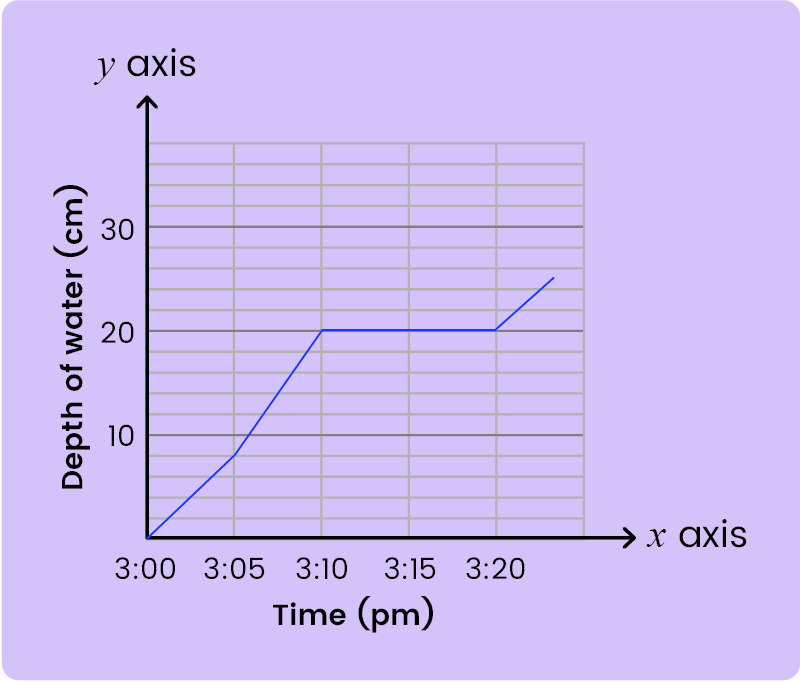
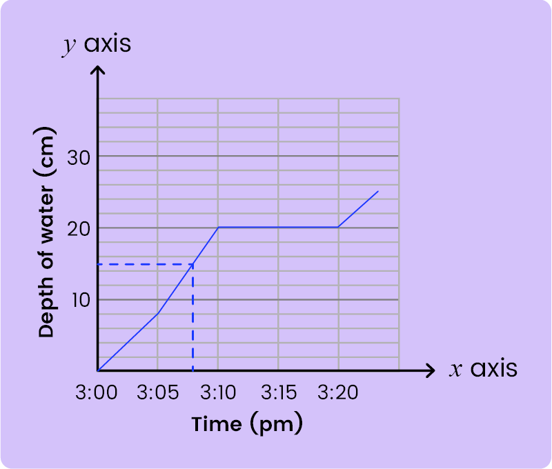
At what time the water was 15 cm deep?
Solution:
Let us draw a parallel line from the Y- axis on the plotted line from 15cm. Join the perpendicular line on the X-axis. Water was 15 cm deep at 3.08 pm.
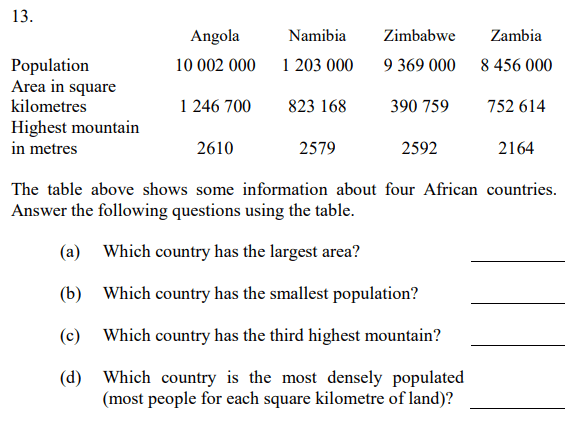
A table can be used to display pieces of data about different things. Tables, in statistics, are a way of showing your information or data. They use rows (horizontal) and columns (vertical). A table also usually looks like a grid, with information and data being put inside the cells. The heading of the table tells us what data is in each column and row.
Example: The table below shows activities done by a number of adults and children.
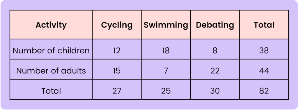
From the table, it can be seen that there were 38 children and 44 adults participating in three different activities.
Let us now try to answer some questions using the above table:
a) How many children participated in debating?
Solution:
Looking at the number of children row and debating column, 8 children participated in debating.
b) How many adults participated in cycling and swimming?
Solution:
Looking at the number of adults row and cycling column, 15 adults participated in cycling.
Looking at the number of adults and swimming column, 7 adults participated in swimming.
Total = 15 + 7 = 22
22 adults participated in cycling and swimming.
Bar Charts or Bar Graphs are another method of displaying data from a frequency table. A Bar Graph is a simple way to show and compare information. The data is represented in the form of bars, the value of which can be read from the frequency information shown at the side of the chart, along the vertical axis. The height of the bar shows the amount.
For example, the following bar graph below shows the number of people choosing their favourite colour during a survey last week. We can see that the bar charts have gaps between the bars and everything (including the axes and chart title) is clearly labelled.
The height of the bar is proportional to the measured number or frequency.
Example: A survey was conducted by questioning 100 students about their mode of transport to school. The results of this survey are recorded in the graph below.
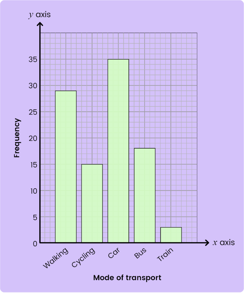
Which mode of transport has the highest frequency?
Solution:
From the graph, the tallest bar is of frequency 35, and the mode of transport for the same is shown in the x-axis as a car.
A time graph is used to study the rate of change in distance, speed and velocity with time. Time is represented on the x-axis and the distance/speed/ velocity on the y-axis.
A distance-time graph is a useful way to represent the motion of an object. It shows how the distance moved from a starting point changes over time. Time is always on the x-axis. Distance is on the y-axis.
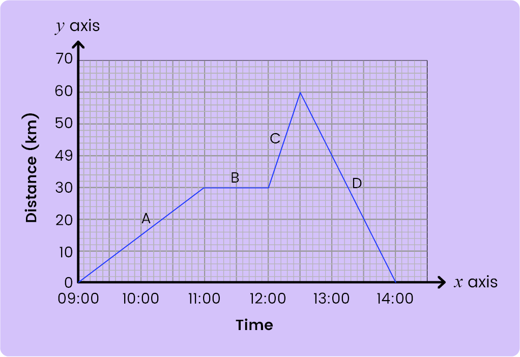
At A, the object is travelling at a constant speed, so it is shown with a straight diagonal line, where the gradient of the line tells you the speed.
At B, the object is stationary, so its distance does not change as the time taken increases. This means that for a stationary object, the line is flat and the gradient (the speed) is zero
At C, the object is travelling at a constant speed again, but this time it is faster, so the straight line is steeper - it has a larger gradient.
Example: Jack drove 80 miles from his home to London. He stopped and visited his friend Nike on the way. Here is the time distance graph for his journey.
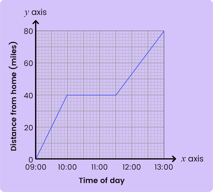
a) How far was Jack from home when he visited Nike?
Solution:
Jack stopped and visited Nike, so his distance will not change when Jack is visiting Nike. Hence, reading from the graph.
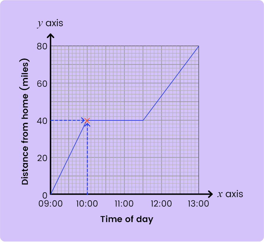
Jack was 40 miles from home.
b) How long did Jack stop for?
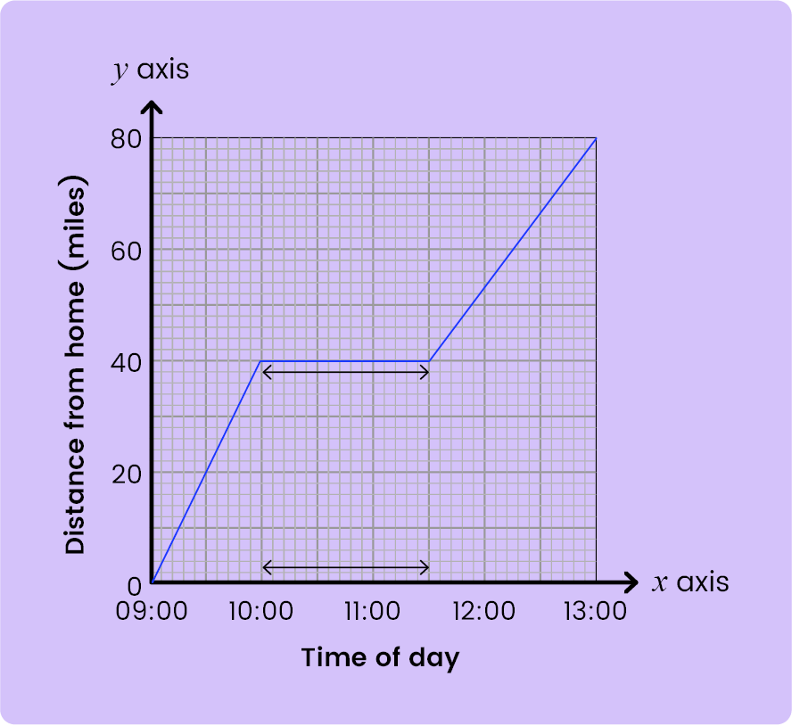
The graph shows a horizontal line from 10:00 to 11:30 = 1 hour 30 min
A pie chart is a circular chart used to compare the sizes of data sets in relation to one another. Pie charts display information by dividing a circle into different-sized pieces to show each measurement. The slices of a pie chart are proportional to the different items in the data set; the larger the slice size, the higher the frequency of data in that category.
Pie charts look like the chart shown below.
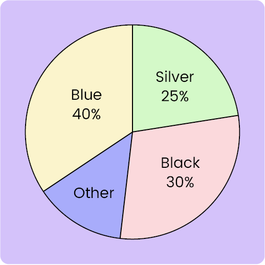
The pie chart above shows the percentage of colours in bikes in a parking area
The circle (360 degrees) represents the whole and the separate parts (or sectors) fit together to make the whole (circle).
Example:
The pie chart below represents the number of Students in three different classes in a school.
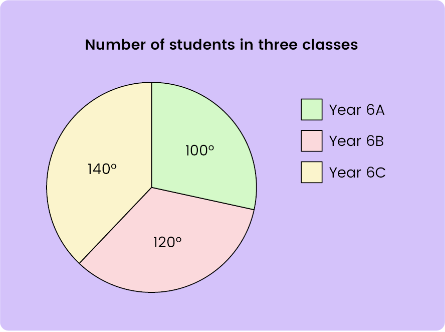
If the total number of students in all three classes is 72. Find the number of students in each class.
Solution:
Here, to find the number of students in each class we apply the below formula:
Angle⁄360° × Total or Percentage⁄100 × Total
Value of each sector = 360⁄72 = 5
Number of students in Year 5A = 100⁄360 × 72 = 20
Number of students in Year 6B = 120⁄360 × 72 = 24
Number of students in Year 6C = 140⁄360 × 72 = 28


What counts as a "good" score will vary depending on the school you want to attend. The standardized 11 Plus test score average across the country is roughly 100. The highest average in some areas is 111. The lowest scores would often fall between 60 and 70, while the highest scores would normally fall between 130 and 140. To achieve excellent marks on 11+ Maths Exams, practice 11+ Maths topic-wise questions.
The best way to prepare for the 11+ Maths Exam is by practicing 11+ Maths topic-wise questions regularly.
Maths online subscriptions are “Non-Refundable“. No refunds can be issued for any reason. This is because of the nature of digital products.
You should, therefore, make sure that the Maths online subscriptions fulfil your needs before you subscribe.
As these are digital products, we advise parents to go through our Free Past Papers provided on our website and once decided they can buy subscriptions.
The majority of the 11 Plus Maths questions are mathematical problem-solving, where pupils need to understand and apply mathematical concepts. With regular practice of 11+ Maths Topic-wise questions, you will pass the 11-plus Maths Exam with a high score.
The children must master the following topics for the 11 plus exams
Get 10,000+ Topic-wise questions by subscribing to our 11+ Maths Topic-wise questions. These questions are collected from 180+ Maths past papers.
11 Plus Maths Past Papers Subscription
Any PiAcademy Memberships are for 1 year (366 days), We give Instant unlock to all exam Resources So that you can plan your 11+ Preparation according to your convenience and as per our Planner Spreadsheets.

Hurry! 11+ Exams are approaching in 6 months. High competition. Most parents fail to do structured planning for the 11+ Exam preparation.
Get a plan and strategy from 11+ Expert Tutors. Avoid the common mistakes that other parents make.


© 2014 - 2024 PiAcademy Limited, All Rights Reserved